
Nod
Built in partnership with pediatric sleep experts, Nod is the first app to understand a baby’s trends and key problems and provide personalized sleep training recommendations for parents to follow every day.
I joined Nod early in development and delivered design, product prioritization, and user research from a 40 user closed alpha, to a 150 person beta, to over 55,000 lifetime users. My challenges were to deliver a delightful experience that tired, sleep-deprived parents could easily use to learn and identify patterns and trends, as well as other meaningful insights that would get their baby (and them) sleeping better, longer.
Over the course of 2+ years, I delivered two versions of the coaching experience and three iterations of the tracking experience, designed the core insights experience, integrated a premium subscription model, and created a beta “real-time” help feature to allow parents to connect with help immediately.
Role & Contributions
Concept, create, prototype, and test designs for all new and existing Nod features
Constant iteration of live features based on user feedback and recurring testing
Create, maintain, and expand the Nod Design System
Run all UX Research initiatives (including crafting scripts, running moderated and unmoderated user studies, phone and video interviews, card sort exercises, and look-a-like audience surveys)
Competitive and industry analysis
Design all brand and marketing initiatives (including nodtosleep.com, Nod external assets, and all social media elements)
Copywriting and editing for product, marketing, and social
Build timelines and estimates for accurate planning of work
Accomplishments
Grew Nod from an 80 user beta test to 55,000+ lifetime users
Successfully converted a free app into a freemium subscription model
Finalist for Best of BabyTech 2018 at CES
Nod App installed in over 100 different countries

Evolution of Nod’s Homescreen AND design aesthetic
Not being a parent (yet), I quickly realized that users are most likely using the app for bedtime, naptime, and overnights, and that it probably shouldn’t be an overwhelmingly (blinding) bright white.
Nod’s dark theme was born.

Nod’s Coaching System (V1)
Nod’s coaching system is a simple card style interface that hides a powerful AI backend. Cards are color coded and have subtle hints as to how you are progressing through a goal. Cards are intentionally concise and written in a friendly but “down-to-business” voice, since parents can be looking at this during a meltdown or a 2am wake up.
Goals are recommended based on either the answers you give during a quick set-up flow (see below slideshow) or after a day or two of tracking. A user can then accept that recommended goal or choose from the full list of goals that Nod offers. Once a goal is selected, users would track their baby’s sleep and feeding session normally and Nod would deliver a series of steps based on the analysis of the tracking data. The coaching plan would then self-adjust based on how well the baby was responding to the recommended steps. Babies that did well moved through steps quickly with few variations. Babies that were having a more difficult time would branch off into different steps that would either offer new steps and solutions or recommend a completely different goal that would be more beneficial at that baby’s developmental stage.
DIAGRAM OF ThE FIRST VERSION OF NOD’S COACHING FLOW
Early versions of the coaching algorithm focused on the user building a bedtime and nap routine before getting a goal recommendation. This was changed in the following version to get users into goals faster.
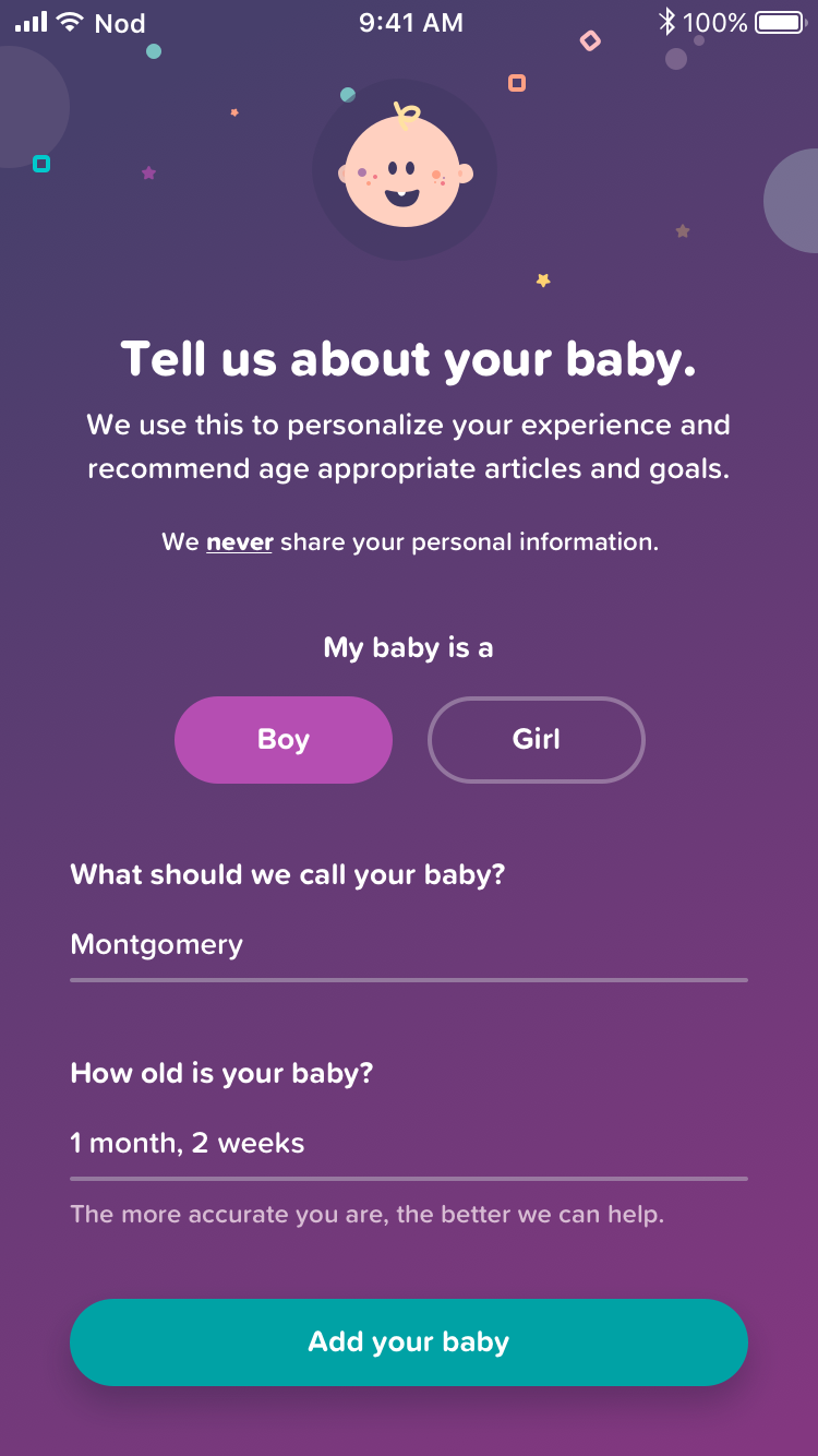
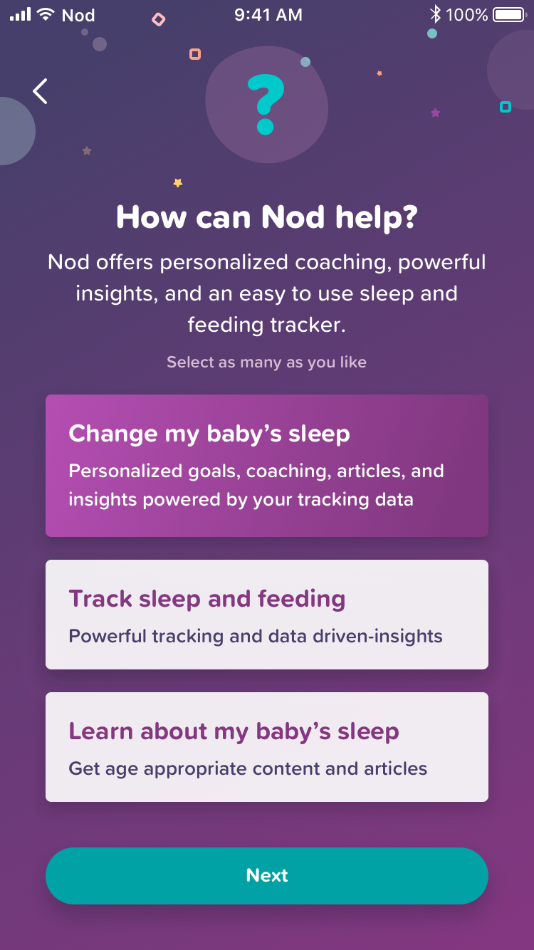
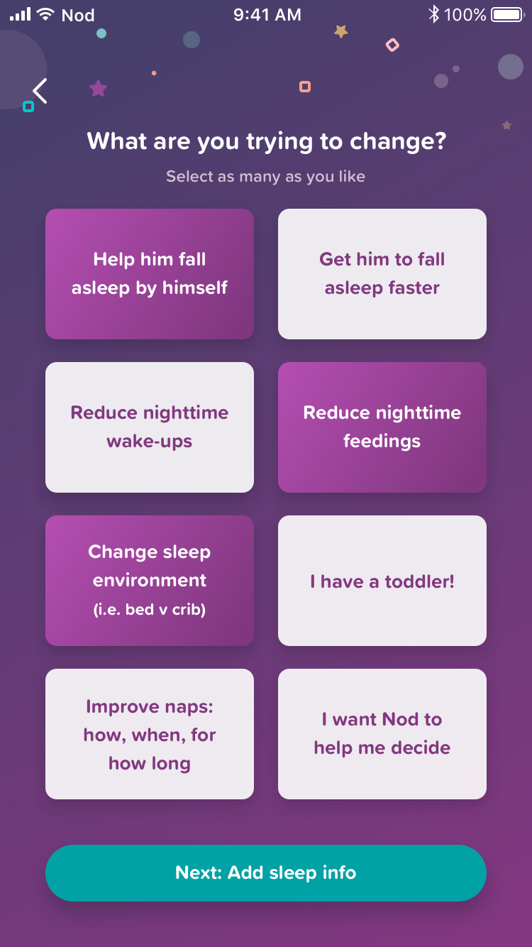
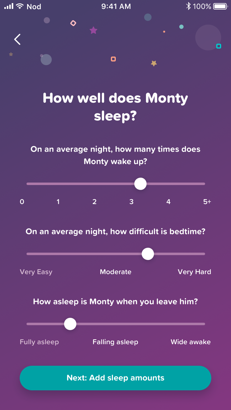
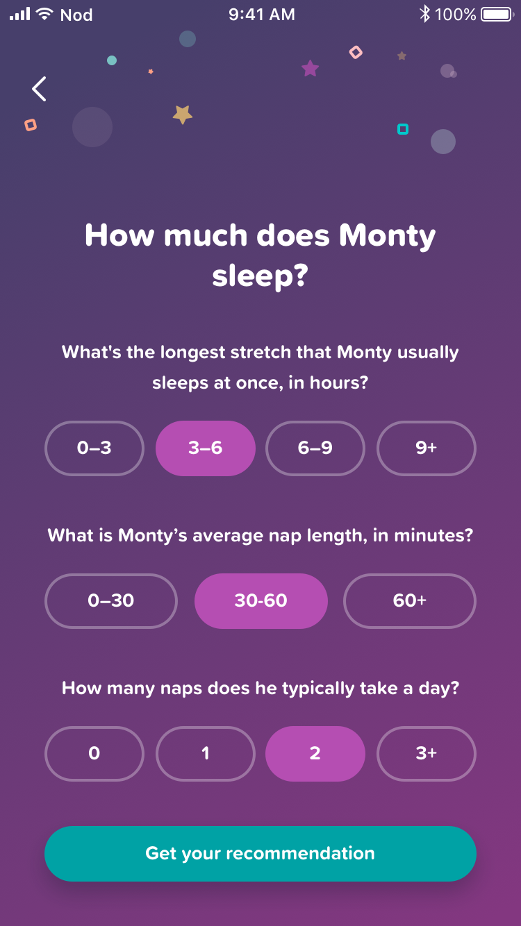
Nod’s Setup Flow
In order to recommend goals as quickly as possible, after launching we added a quick setup flow to gain insights into the current issue(s) a user might be facing.
Before launching this, I ran a series of both moderated and unmoderated user tests to identify any critical issues around usability, copy, and length of the setup.
Findings were favorable and we launched with minor tweaks to some of the copy.
Click the image to view larger.

Early V3 entrypoint prototype
Nod’s Tracker
Core to the Nod experience, the Tracker is how the app translates a baby’s activity into actionable insight for the parents.
Version 1
Our first take. Despite initial success in testing, we found that at a larger audience size:
Users were having a hard time understanding that they could change the start and end times
Users wanted some ability to add a wake-up in the night without stopping the timer
The primary action on the tracker needed to be more clearly identified
Version 2
With the second version, we had a bit more of the Nod brand solidified and some new concepts we had tested based on the Version 1 tracker. This version has been the longest standing version.
A new, more visually pleasing entrypoint with a clearer path to add sleep and feeding sessions without a running timer
Simpler start and end time layout with the addition of our “Wake Ups” control. An inline help affordance was added here to help clarify when to use this control
Added “last side,” “active side,” and “most recent” side in the breastfeeding tracker so it was easier for breastfeeding parents to remember what happened last time they tracked
Clearer primary action buttons
The ability to add a note to a tracking session
Version 3
Still in development, Version 3 adds the most new features to our tracker.
A new in-place entrypoint to the tracker
The ability to pause sleep without stopping the session
Clearer editable text areas
Solid food tracking
The feeding tracker is now broken into 3 pages; breast, bottle, and solids
An optional bottle timer
One of the most requested features, the ability to add previous sessions while live tracking
New Add Previous Session Flow
Allows users to input as many past sessions as they want while the current tracker is running. A common use case for parents with children in daycare.
Add Previous icon exploration
Early Add Previous (batch entry) flow diagram

Alternate single page feeding tracker concept
Total Sleep Graph & Statistics
Total Feedings Graph & Statistics
Bedtime & Wake Up Consistency Graph & Statistics
Insights
Early into Nod’s launch we released our Insights section. Graphs of a user’s tracking info was our most requested feature. We brainstormed as a team and decided on what the three categories of graphs and their statistics would be.
Total Sleep Graph & Statistics
Users can view total sleep, daytime sleep, and nighttime sleep over 7, 14, and 30 days as well as population statistics and overall averages.
Total FEEDING Graph & Statistics
Users can view total feedings and how it affected total sleep over 7, 14, and 30 days as well as population statistics and overall averages.
Bedtime & Wake Up Consistency Graph & Statistics
Users can see how consistent their baby’s bedtime and wake up times are over 7, 14, and 30 days as well as population statistics overall averages.
Note: Overall views were designed but the volume of data that needed to be loaded slowed the app to a state we found to be detrimental to the experience and were never shipped.

Brainstormin’
Vision for Nod
Work in development
Coaching 2.0
For most of Nod’s users, Coaching is why they came to us over any other baby tracker and for the most part it works really well. Parents and babies had 2 fewer night wakings and 2 more hours of sleep at night within 14 days of using Nod. Even with results that good, we knew the system could be better. I put together a script and our CEO and I called up 10 parents to see if our coaching met their expectations and, if not, what we could do to make it better.
What we found in their comments became our Coaching 2.0 experience, including:
The ability to see what their plan was going to look like upfront
We added an in-depth plan with the ability to click into each step even if you haven’t gotten there yet
See how much progress they have made
A progress bar is now visible at all times on the homescreen, the goal detail pages, and the step detail pages
Not only an at-a-glance synopsis of the day’s step, but an in-depth look at what that step entailed, why we needed to give them that step, any other ways to complete that step, and frequently asked questions or concerns about that step
Each step card has a “read more” button that lets you find out all the details about that step
A way to skip a step either for a day or completely
Users can choose to skip a step for the day or forever from the step card
A way to let us know how they think the night went
Nod delivers a follow up question every morning to check in on how a user thought the night went before giving them a step that day to verify our next card was correct. This stemmed from a complex issue where their tracking data showed us it was a “good night” but in reality, the parent might have had a more difficult experience than they were able to input into the app.
Newly expanded Goal Detail page
Step Detail view…

Now, see your estimated plan upfront

…including common questions and more
Navigation Bar & Updated Recent Activity
Some additional updates that were designed were:
a navigation bar to help users move through the app easier and quicker
a new Recent Activity section with both a 24-hour and today view and expanded details
